Josef Albers
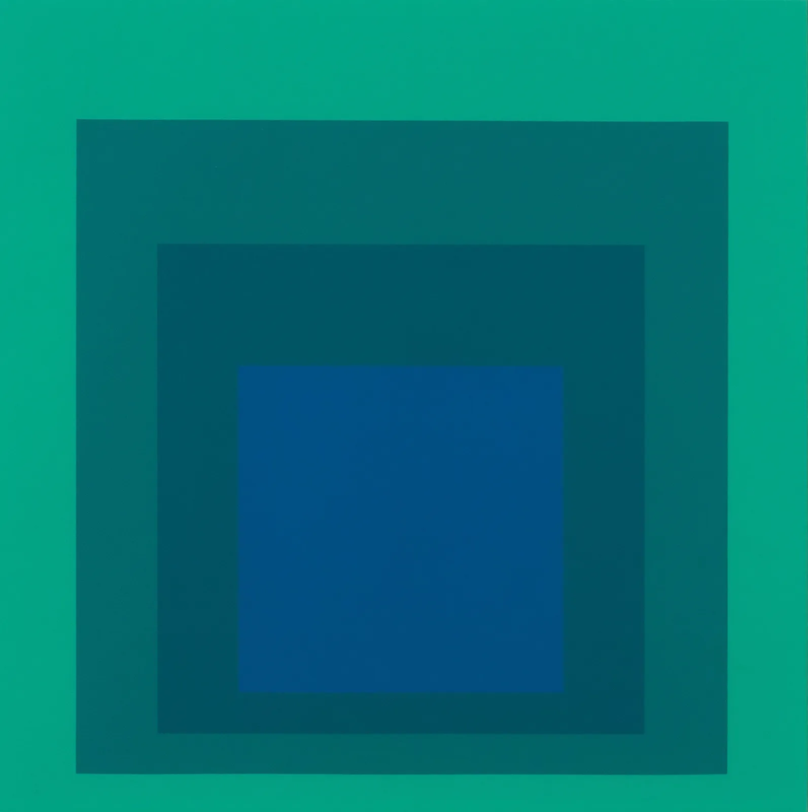
Josef Albers’s EK Ia, completed in 1970, exemplifies the artist’s lifelong pursuit of perceptual clarity and chromatic truth, rendered here in a screenprint of luminous restraint. Belonging to the Edition Keller portfolio—a suite of screenprints issued in close collaboration with the Swiss publisher and gallerist Max Keller—this work operates not as a secondary record of a painting, but as an autonomous site of visual experimentation. The composition follows the canonical Homage to the Square format: four concentrically aligned squares, rendered in subtly shifting shades of blue and green. Yet the effect is anything but formulaic. Rather, EK Ia presents a distilled visual phenomenon: the sensation of movement and depth achieved through the flat and immutable surface of ink on paper.
Unlike Albers’s earlier explorations in oil, where texture and brushwork occasionally interrupted the flow of color interaction, the screenprint format—as executed on Hahnemühle Buttenboard—allows for an absolute clarity of hue. Here, each layer of color holds fast to its edge, revealing the artist’s exacting attention to proportion and tonal progression. The surface reads not as layered pigment, but as chromatic field, pushing the viewer into an act of sustained looking. As Albers understood and taught throughout his decades in the U.S., color is never seen in isolation; it is always relative. In EK Ia, the velvety center of indigo seems to glow or darken depending on the viewer’s proximity and the interplay of surrounding greens—an effect achieved not through illusionism, but through calibrated adjacency.
The Edition Keller prints, of which EK Ia is a cornerstone, mark a key moment in Albers’s engagement with European print publishers at a time when his influence in American academia and museum culture had reached its apex. This series served both as an international extension of his Homage project and as a refinement of its core principles. The uniformity of scale and paper, the high fidelity of the inks, and the precision of the printing process allowed Albers to treat each sheet as a discrete perceptual experiment. In this respect, the EK portfolio may be read not only as a body of graphic works but as a sequence of visual propositions—each print testing how color can activate space, construct illusion, and destabilize certainty.
In the broader landscape of postwar American abstraction, EK Ia occupies a position of quiet but unshakable influence. While figures such as Rothko and Newman explored transcendence through scale and gesture, Albers turned inward—toward the science of vision and the architecture of the square. His was an art of restraint, yet within that discipline lay extraordinary freedom. Generations of younger artists—Ellsworth Kelly, Donald Judd, Carmen Herrera, and even Bridget Riley—found in Albers a model for abstraction not rooted in emotion or expression, but in perception itself. In an age when American art was redefining its global role, Albers offered a vocabulary of color as language, form as syntax.
EK Ia, then, is more than a print—it is a lesson in seeing. Through its precisely weighted chromatic fields, it offers no narrative, no metaphor, no symbol—only the phenomenon of vision encountering structure. It asks the viewer not to interpret, but to perceive. And in doing so, it reminds us why Albers’s work continues to resonate today: it is not bound to style, but to experience. As a cornerstone of the Edition Keller portfolio, EK Ia enacts Albers’s lifelong argument that color is not something we see, but something we apprehend—moment by moment, eye by eye.
NOTES
This artwork is initialed, dated “70”, titled and numbered in pencil, from the edition of 125.
Provenance
Private collection, EuropePrivate collection, United States


